These fonts were made as a typography study for practice in not only how to use fonts but to create them completely custom. With the thousands of fonts out there, it's easy to search for a typeface and apply it to a design. It's never quite the same as home-style-craft though. These two fonts were meant to test my skills and create a font from sketching to application. The results of this test were Slant and Girder. One thing that was absolutely necessary was to make both fonts unique and stand out.
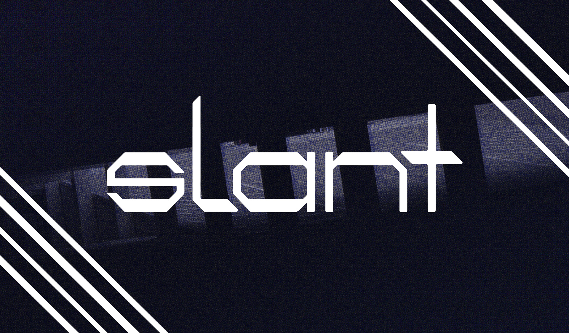
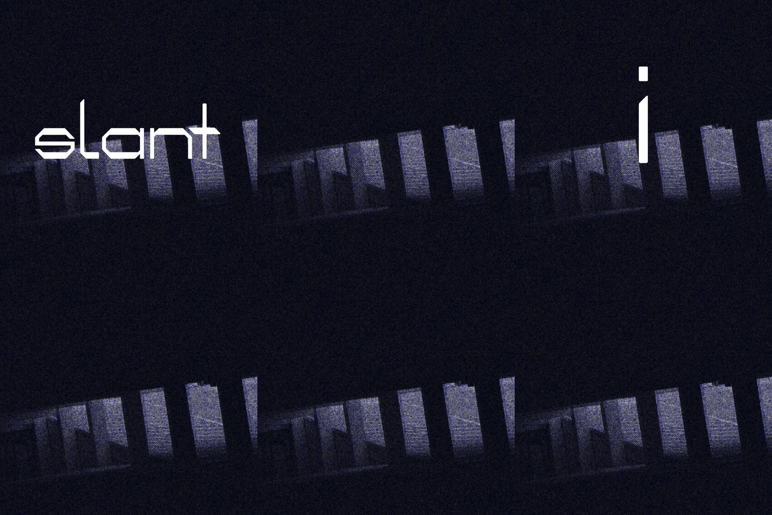
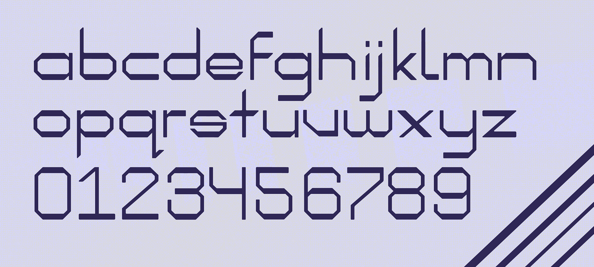
Slant is the geometric, sans serif, display font with defined forty-five-degree counters and thick horizontal strokes. The shapely forms without serifs create its iconic geometric sans serif classification, whilst its bold styling and sacrificed small-scale legibility makes it a perfect display font.
What makes Slant stand out in the crowd is its reverse contrast letterforms. Instead of the typical, boring orientation of wide vertical strokes against thinner horizontal strokes, Slant does the opposite to create the visually interesting display font shown above. This along with the clear forty-five-degree counters makes for a futuristic, industrial feel that catty-corners the expected. A font with style and flair that takes hold of the work’s appearance and defines the story it’s laid against.
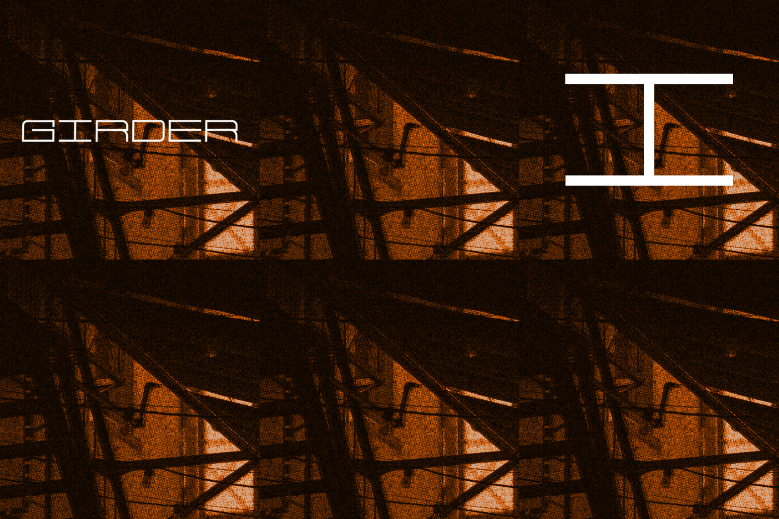
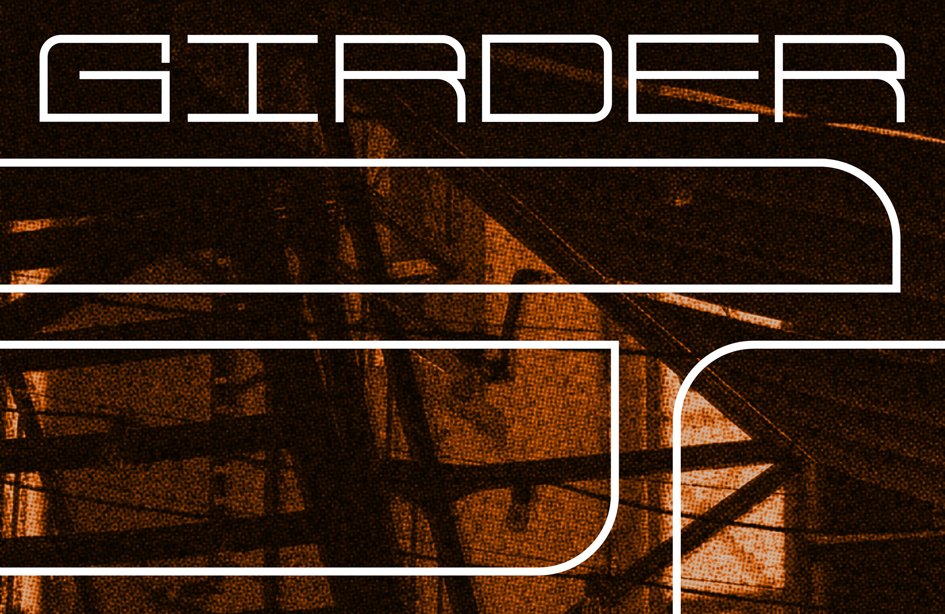

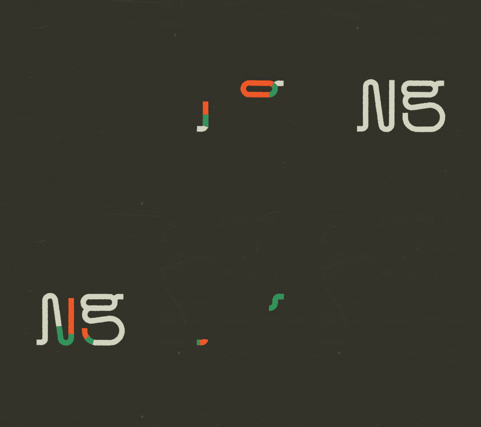
Now say hello to Girder, the geometric, monospace, sans serif, display font for those who like curves and hard edges! With each letter form having the same width and shaped with circular and rectangular corners, the geometric and monospaced typeface without serifs tackles sans serif in a whole new way.
The juxtaposition of hard, ninety-degree joints against the soft, rounded corners creates a visually interesting font that has a little bit of everything. The mono-width type captures the geometric feel and gives the feeling of precise engineering to those wide all-capital letters. Giving the font the strong structured forms that could brace a hundred-story building while still capturing the natural flow of smoothed typography.
The font was designed as a display font for large-scale use and not for body copy, as it staggers headlines and frames the hierarchy of a design. A font that is made to catch attention and define the overall feel of a design.
The two fonts ooze with personality and attract the eyes to reading further into the design or to stand alone as the key piece of artwork. A great challenge but it pushed me to be creative with the typography's design and work towards a cohesive system.
