This project was made to challenge me in creating a user interface design for a fictional application called Cabbi. With the immense popularity of apps like Uber and Lyft, it's no wonder that industry is so popular. However, brands like these still have their pitfalls in their product. As such, this app was meant to look toward the future and introduce autonomous vehicles to the world of ridesharing.
When trying to create a successful application, the first important step is doing your research on the topic at hand. As such, deep analyses of the current users of these ridesharing apps, the market and revenue of the product, as well as the problems the companies face were all thoroughly explored to ensure a proper understanding of the task at hand and what the solution would be.
With one company, Didi, averaging 30 million rides daily and 10 billion trips annually and an expected market worth of $220 billion in 2025, it was clear that the industry was successful. However, these apps all share similar problems due to the nature of current ridesharing limitations.
The first problem is that the service isn’t private with the limitation that the driver has to share the car’s cabin too, well, drive. Meaning that the users can’t feel comfortable talking about intimate or confidential topics and ruining the experience of the ride. Secondly, the service is limited to the driver’s availability meaning that customers can only use the service at certain times of the day when a driver is free. Meaning that busy hours and unique times like 5 o’clock in the morning aren’t available to riders who need it the most. The third issue is that the small enclosed spaces typically lead to awkward interactions that many users would rather avoid. The issue was so prevalent and wanted that Uber responded by adding a “Quiet Preferred” option due to customers’ complaints. Finally, these services can lead to assaults and dangerous targeting that can lead to assaults and endangerment. A Uber report found that there were around 6,000 reports of sexual results between 2017 and 2018 and 19 people had been killed in physical assaults' involving Uber rides.
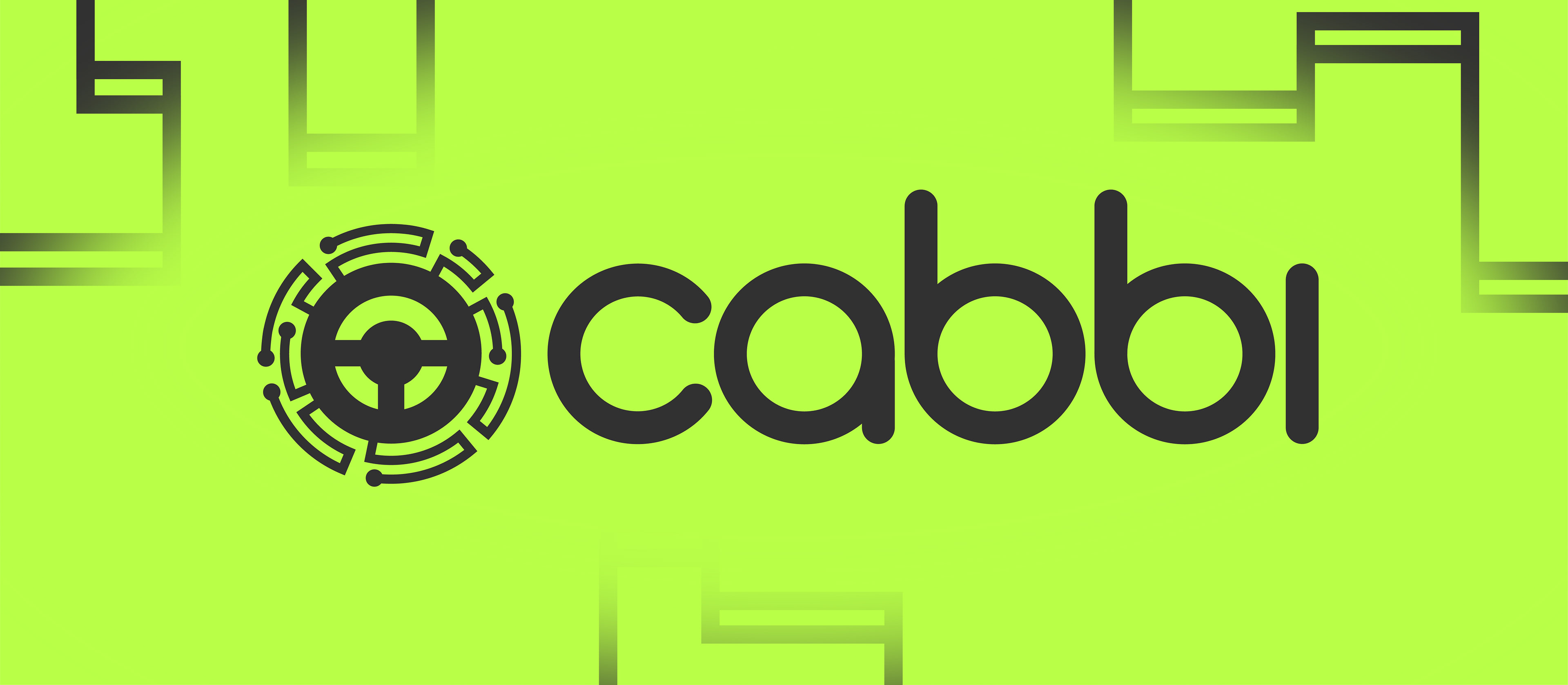
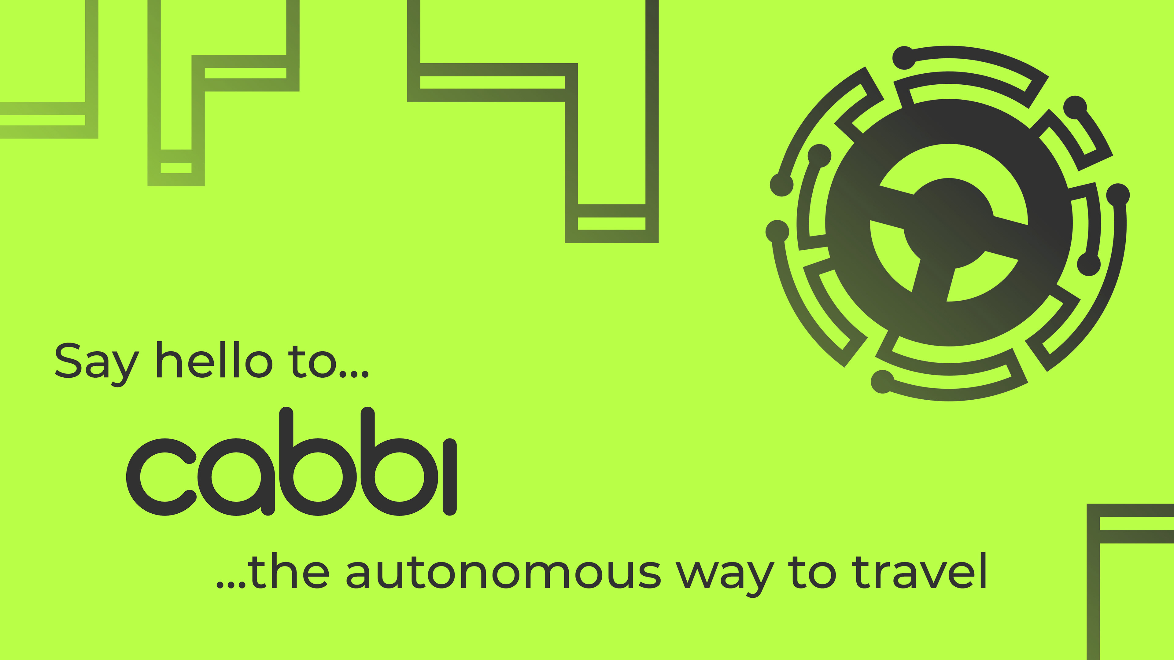
The solution to these problems is Cabbi, the autonomous taxing service that gets you from point A to B with speed, ease, and comfort at any time of day.
Along with ridesharing global market values, the self-driving car industry is very successful. By 2023, self-driving cars are projected to have a global revenue of $173 billion. A large majority of this expected revenue comes from ridesharing services. In fact, companies like Uber, Lyft, and Didi are implementing autonomous vehicles into their services. Lyft has already had 100,000 successful self-driving rides in real situations, and Uber has used select cities like Dallas to start testing autonomous vehicles in real-world applications.
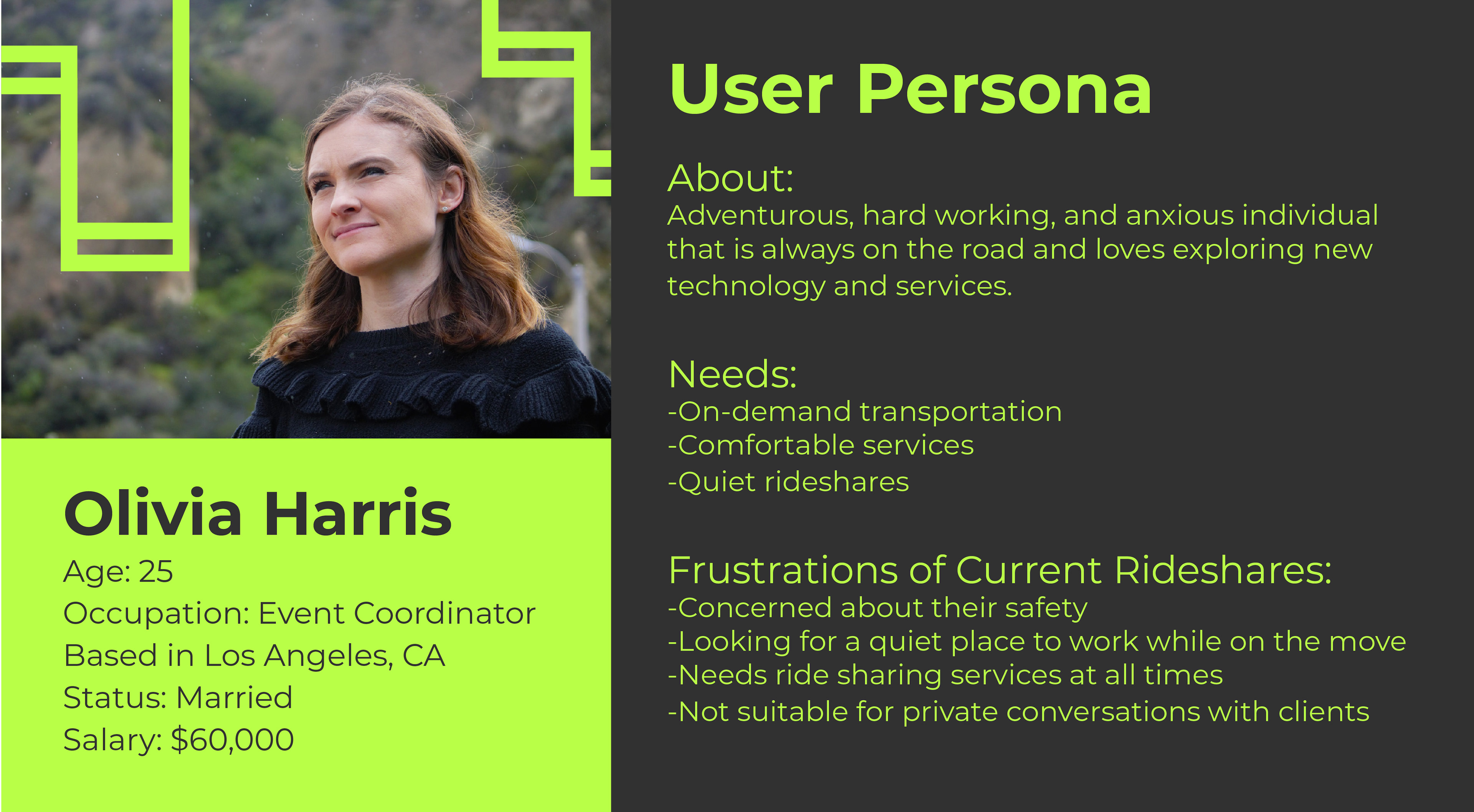
Now that we know the market and product, we need to turn to our users. In this example, our user persona reflects the average target audience for Cabbi. Looking at the user persona, our target audience is people with a median income between 18 and 30 in large cities. We would also be targeting people who might use this service on a daily basis for their jobs or home life. People who want to have safe, comfortable, private rides at any time of day.
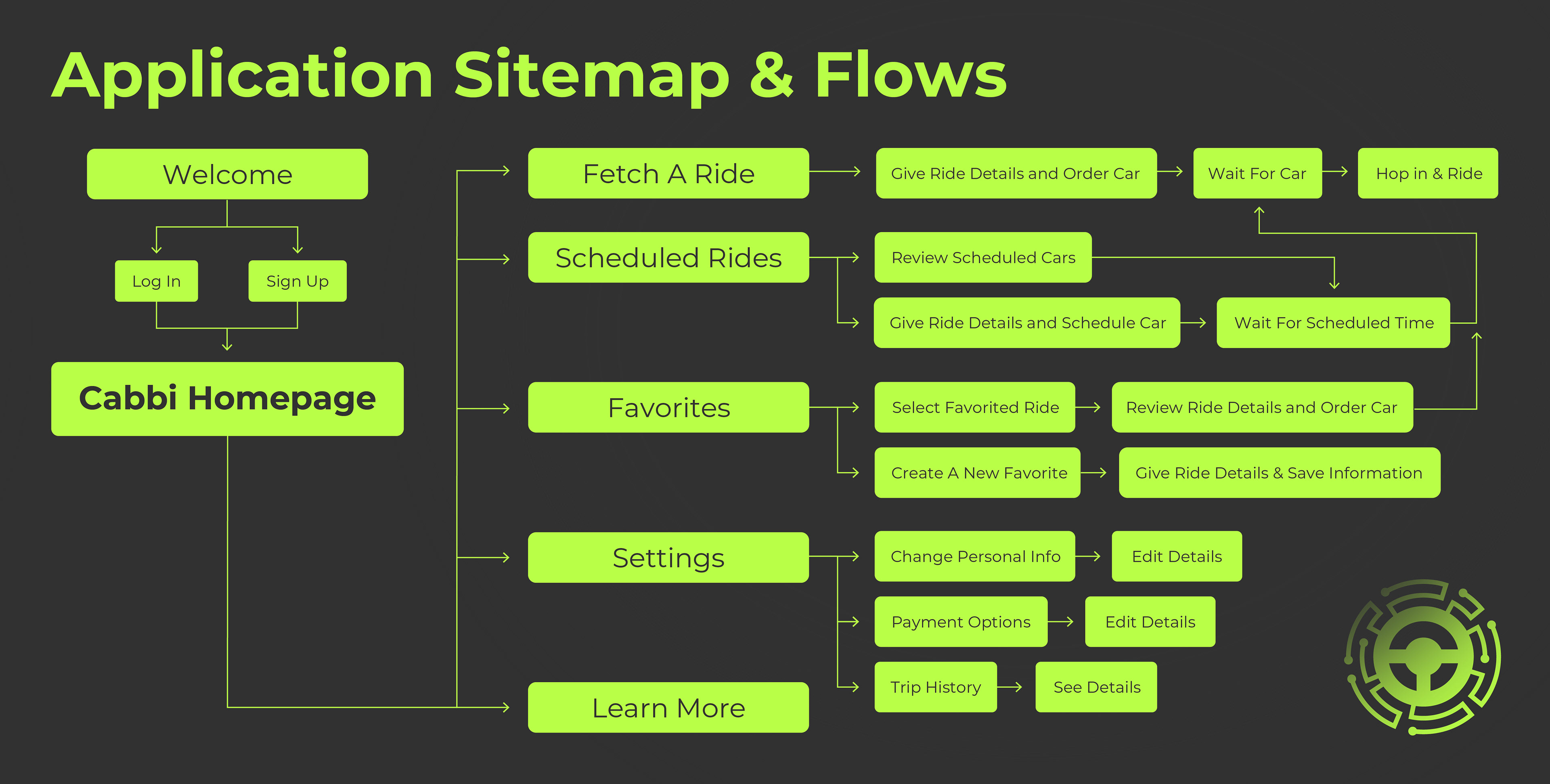
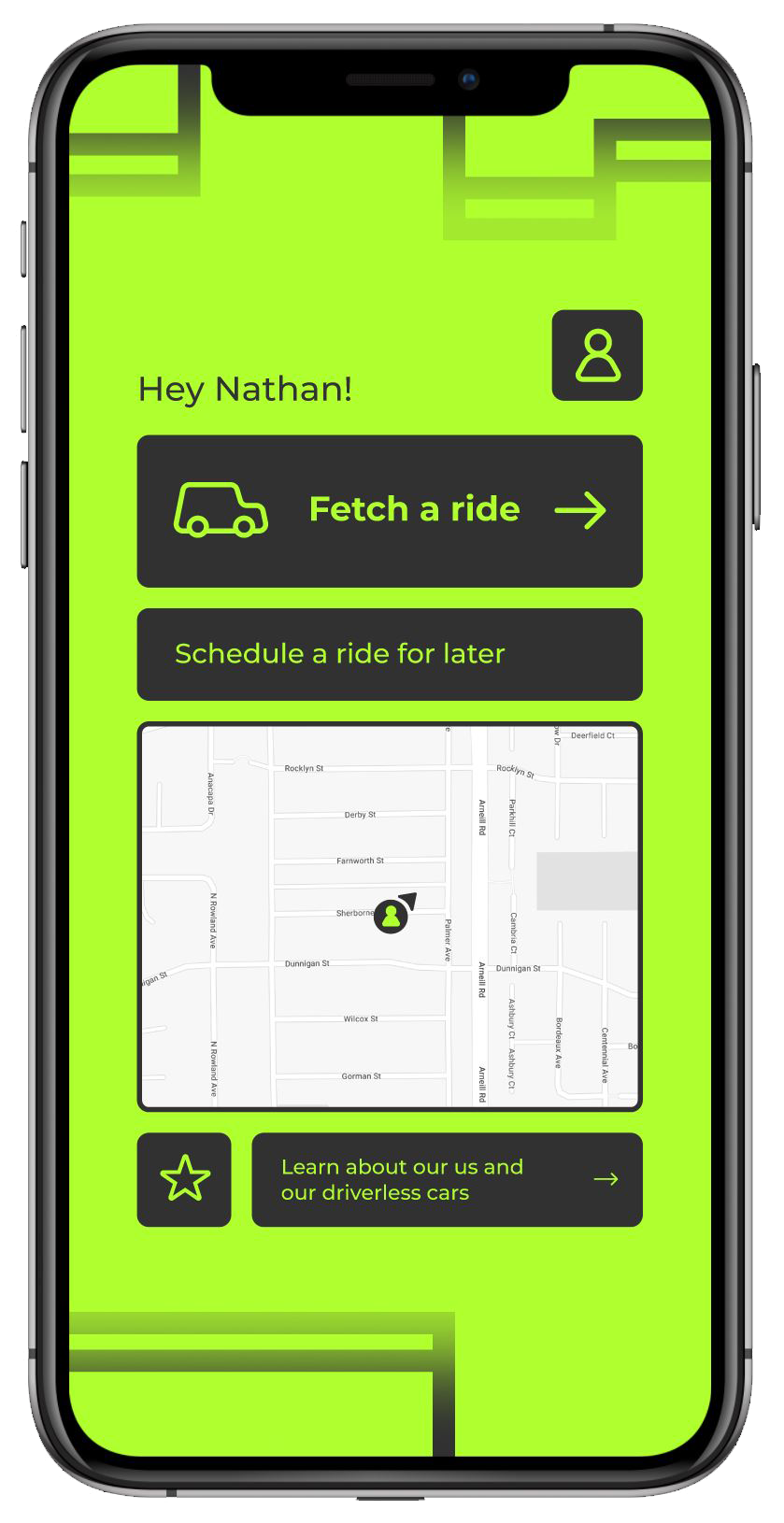
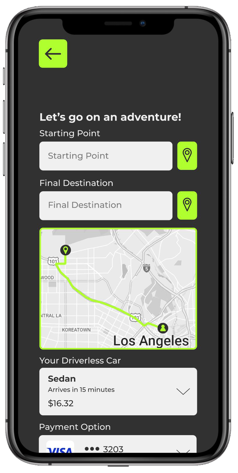
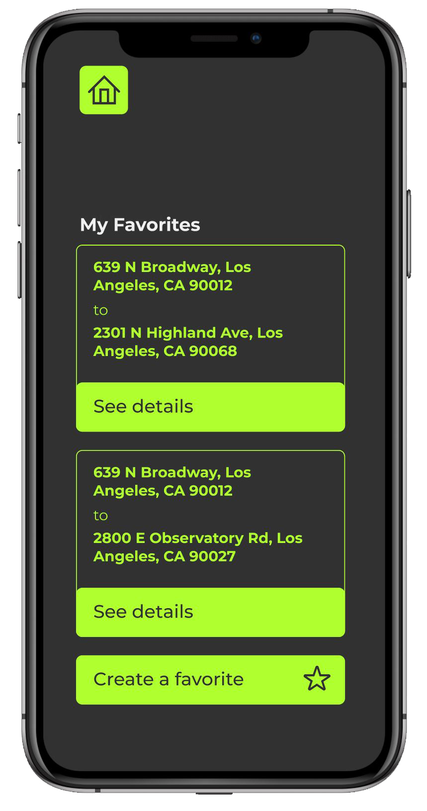
After testing, drafting, and redesigning to meet the needs of the user, we land on the sitemap for the application. After signing in and reaching the Cabbi Homepage, the user has five main paths they can follow: “Fetch A Ride,” “Scheduled Rides,” “Favorites,” “Settings,” and “Learn More.” Each path has a specific function, but they all work together to make ordering an autonomous car easy, fast, and simple.
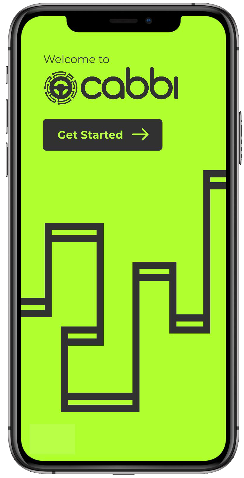
Leading us to the actual design of the project. The app was meant to present a modern, energetic feeling to match the adventurous, new-age technology used in the product and appeal to our target audience. The bright yellowish green against the dark gray portrays this whilst also being accessible to users with visual impairment as the ATI-compliant contrasting colors make reading the text and visuals clear. It also greatly helped in focusing the user’s attention, as the bright green pops out important messages and guides viewers through processes. The logotype along with the logo itself was made to look friendly whilst enforcing the modern technology of AI-controlled cars as nodes that appear as a circuit board wrapped around the steering wheel. Throughout the app and additional elements horizontal bars connected by vertical strokes were made to reflect a map-like structure through the appearance of electrical components. All of these elements together create visuals, form a hierarchy, forge usability, and reinforce the application’s purpose of an autonomous taxiing service

The project was an immense success as it not only expanded my skillset in using Figma but also challenged my user interface skills and paid attention to user experience. If you'd like to take a self-guided tour and see the prototyping, the file can be found here.