The challenge was to create a revamped brand identity for the non-profit organization Kids Cancer Connection(KCC). As the name implies, helps families and kids affected by children's cancer. To transform the out-of-date, 'kiddie' design with a more contemporary look that appealed to all ages.
KCC used bears and stars for its logo. An effective call for young children, but the owners of the company wanted to focus on older audiences and expand their targets to all children and teens. Since most of the viewer base would be parents, the team needed to catch their attention as well.

Original KCC Logo
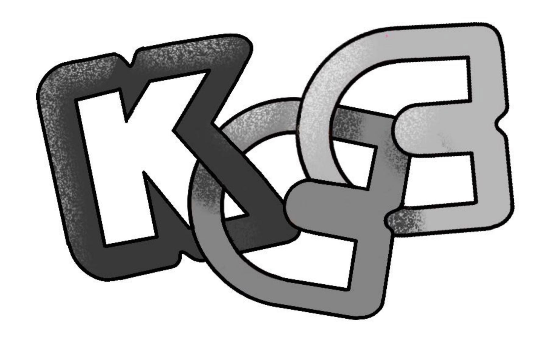
First Draft Of Revised Logo
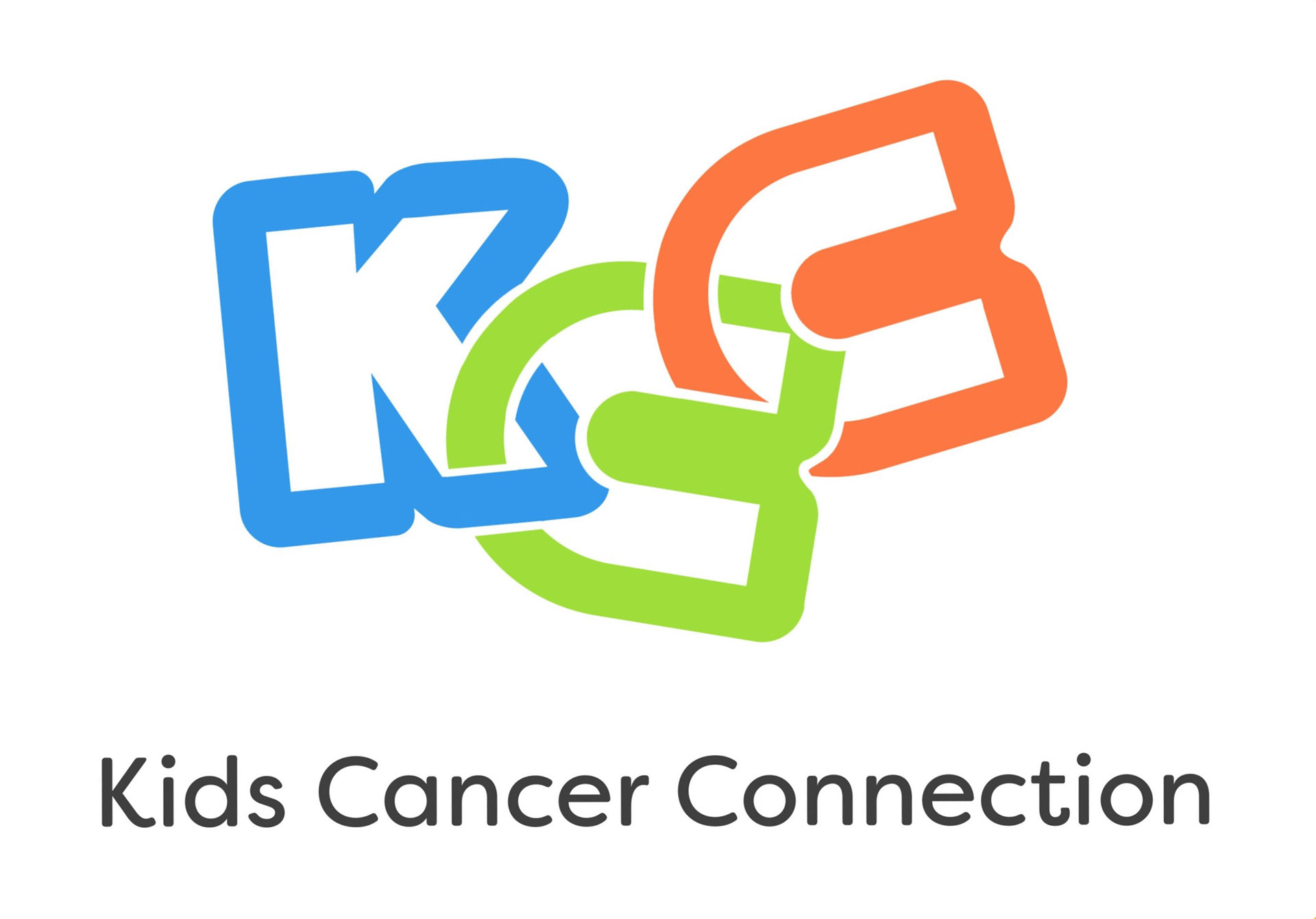
Final Draft Of Revised Logo
The new logo captures the playful nature of the original with bright colors, soft typography, and tilted letters. A meaningful and respectful balance between kid-friendly appeal, teen engagement, and adult needs. As such, the connecting letters were meant to reinforce the idea of a strong chain. This stable icon is balanced by the playful nature of the bright blue, green, and orange of the crooked type to give that kid-friendly appeal.
The first application of the logo was then used on the stationary for the company, where other brand elements like the rounded gradient and long KCC alternative logo were coming to fruition. With functionality being the main focus, the brand and its elements were always kept to a minimum and allowed the content to capture the attention. The blue-green-orange gradient becomes a great consistency throughout the branding of the company to help create an iconic cohesion between each item in the brand identity
Continuing from the stationary, the team wanted to make sure that the company has merchandise and items to make them more identifiable at events. The nametag and t-shirt fulfill this need and do so with the same minimalist styling from the previous uses. This modern, clean look helps create the mature feel that the client wanted as well as creates the professional appeal that was lacking in their previous branding.
In these examples of an Instagram and poster ad, both were made to create focus on the children in the organization. This way people can see the impact they are creating and people can create a more meaningful connection between the viewer and the brand.
The final application for the brand identity study was a website. The main goal of this step was to not overwhelm the viewer with information but to make sure that everything was at their fingertips. To do so, information was kept short and sweet and we made sure to have links ready and clear for any further clarification that the user may need. Once again, we wanted to make sure that the children of the organization were highlighted to touch the hearts of the viewers.
In the end, the project expanded my boundaries and pushed me to create my most extensive brand identity to date. A great project to explore options and broaden my skill set.

