This project was meant to challenge my capabilities in creating a user interface for an application. With more and more businesses pushing for applications to use while in parks, museums, and other venues, the Seven Sea Aquarium was meant to act as a fake institution for this fake product.
Creating this application for my own personal challenge left the needs of the application to be broad but what I mainly wanted the application to accomplish was to: introduce the exhibits, talk about availability, and the hours of the aquarium, talk about them as well as give users a map to guide them through the building.
Starting with the app's overall feel, the main design philosophy behind the app was to give it that underwater feeling. As such, the soft gradient from the top left to the bottom right became a constant theme throughout the app. This against the stark white and striking colors for each subject made for a design that focused the attention of the viewers. Each section of the app was also color-coordinated to create some differentiation between each part of the app and to make it clear that the user moved onto a new topic.
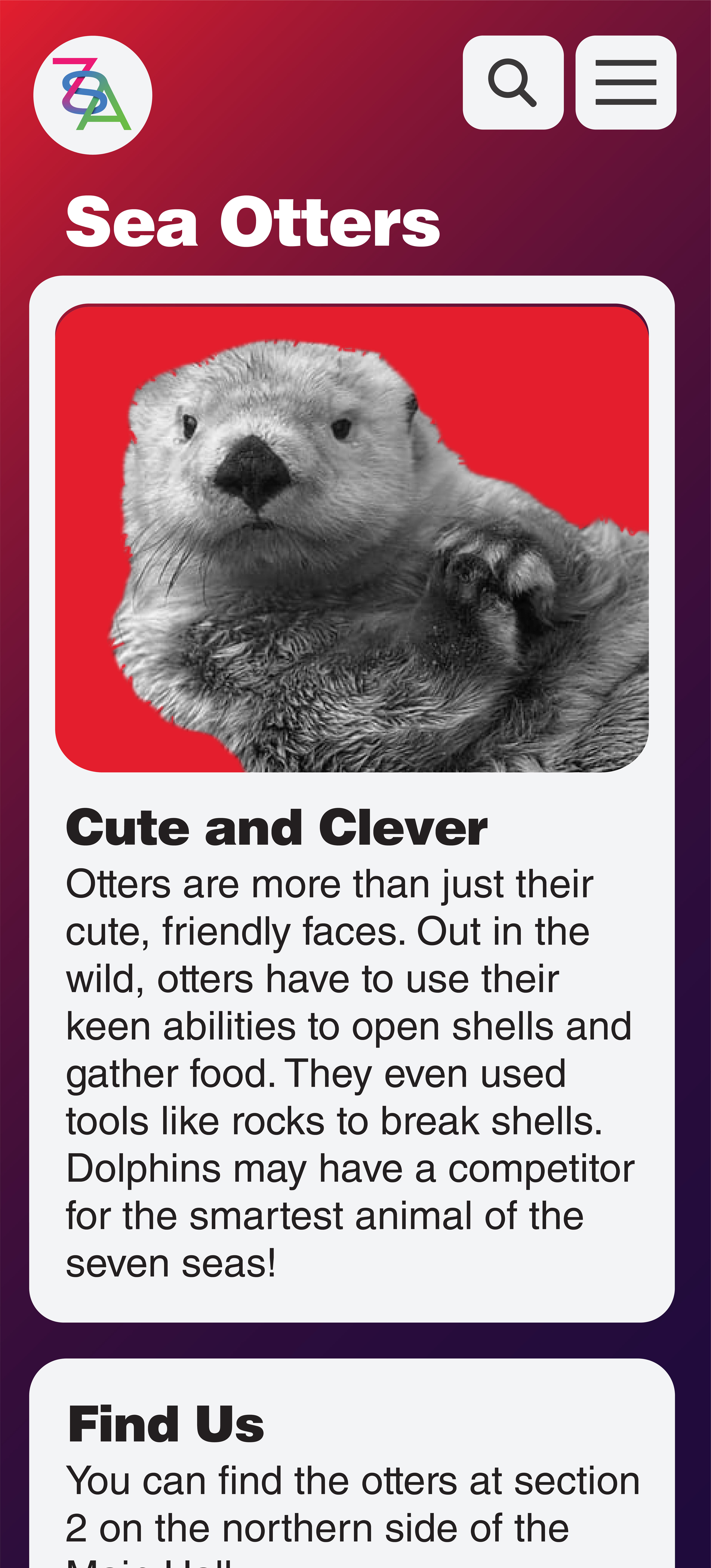
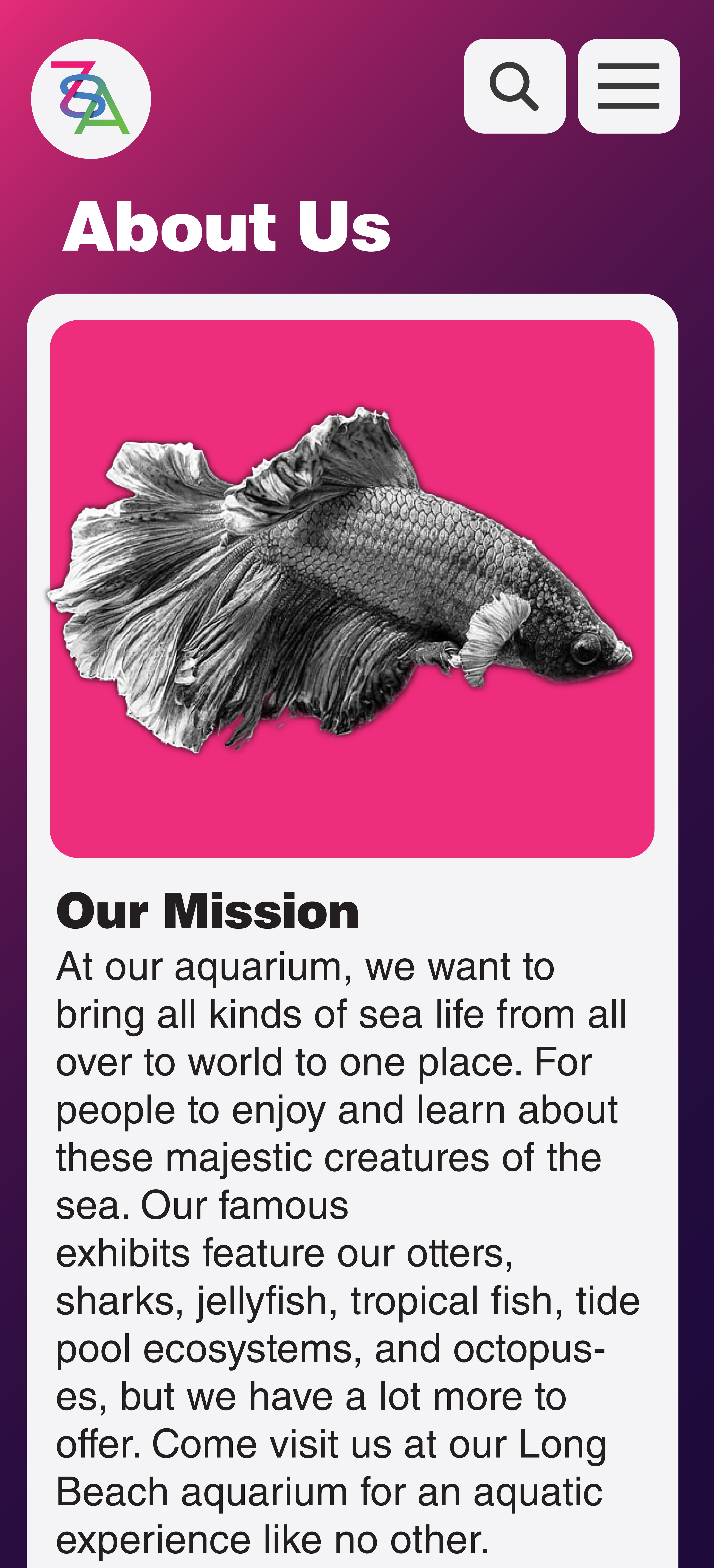
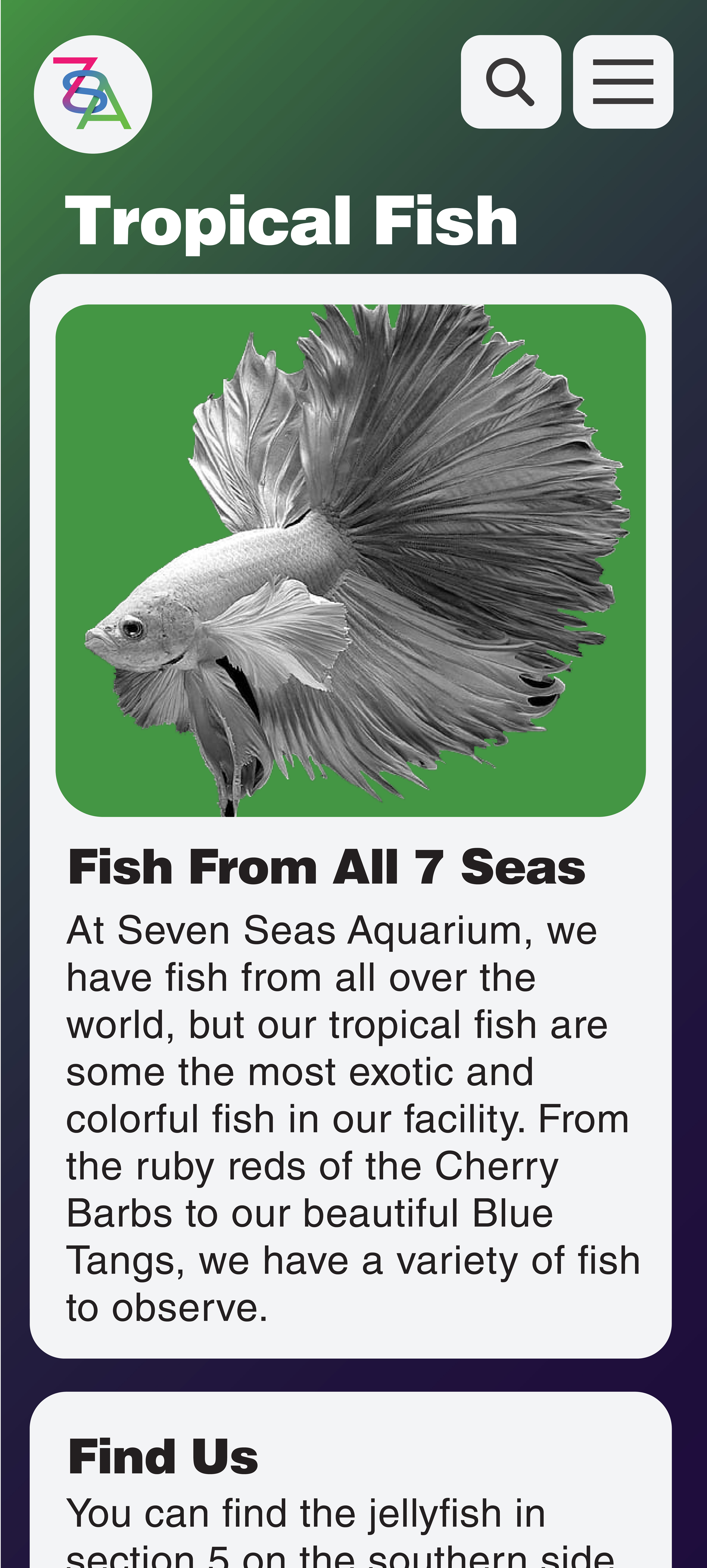
Moving onto the actual integrations of the app, introducing the app was accomplished with fun facts as well as a highlighted location on the map to help find the creature. This would hopefully excite the viewers to explore the exhibit as well as be educational to keep in line with many aquarium's mindsets. The "About Us" and map pages were accomplished in a similar method, whilst the hours and contact pages remained much simpler and ditched the photography to focus on the content itself.
A working mockup of the app can be found at: https://projects.invisionapp.com/d/main?origin=v7#/console/19908021/416747576/preview?scrollOffset=0
The end result was a design that successfully completed the objectives as well as tested my skillset in application design.
